3 artists
Erika Diettes
|
|
|
Erika Diettes is a Colombian visual artist and photographer who was born in 1978. She has a degree in social communications which is evident in her work as the dual focus on art and communication is reflected in her work and her publishings. She also has an M.A in Anthropology. She uses the eduction she has gained to enhance her work.
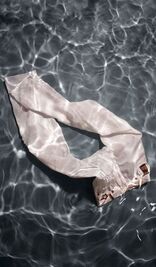
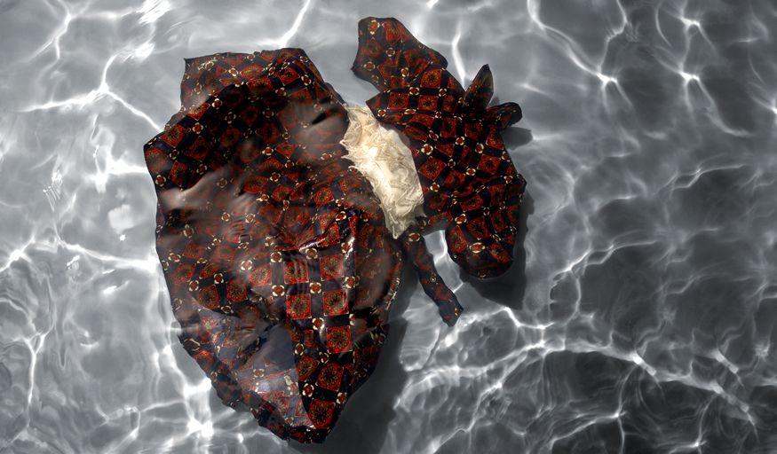
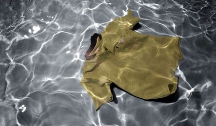
The drifting away project above she anted to draw attention to some of the victims of forced disappearances in the Colombian armed conflict. She decided to submerge clothing and other personal items in turbulent water and then photograph it.
The drifting away project above she anted to draw attention to some of the victims of forced disappearances in the Colombian armed conflict. She decided to submerge clothing and other personal items in turbulent water and then photograph it.
Daniele Tamagni
|
|
|
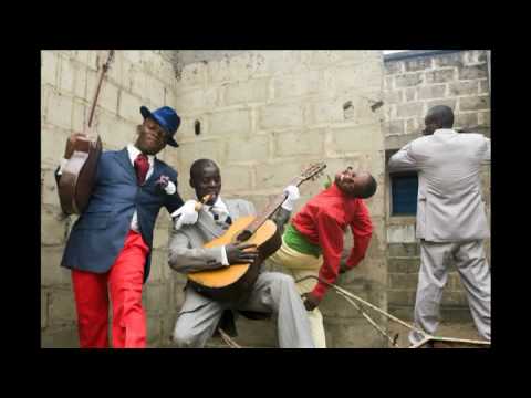
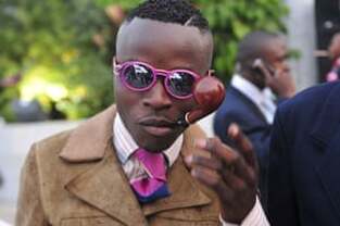
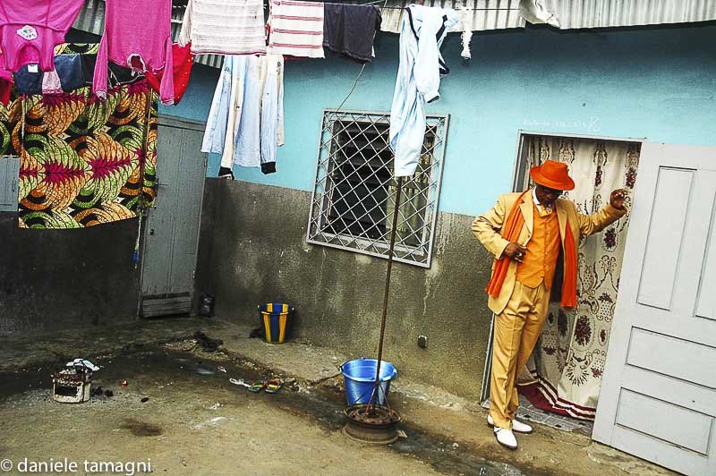
Daniele Tamagmi is an Italian freelance photographer. His project 'Sapeurs of Brazzaville' wom the Canon young photographer award in 2007 . He ten published his book ' Gentlemen of Bacongo' which is the project that I have focused on. In this project he focuses on how elegance is very important in Congolese culture and how the style is massively influenced by there culture. A massive part of the style is the 'sape' and the 'sapeurs' which stands for Society for the advancement of people of elegance. All of this started when Congo was a French colony and people were going to France and came back with the fashion and the French were bringing their style and elegance and influencing the Congolese people.
Vickey Grout
|
|
|
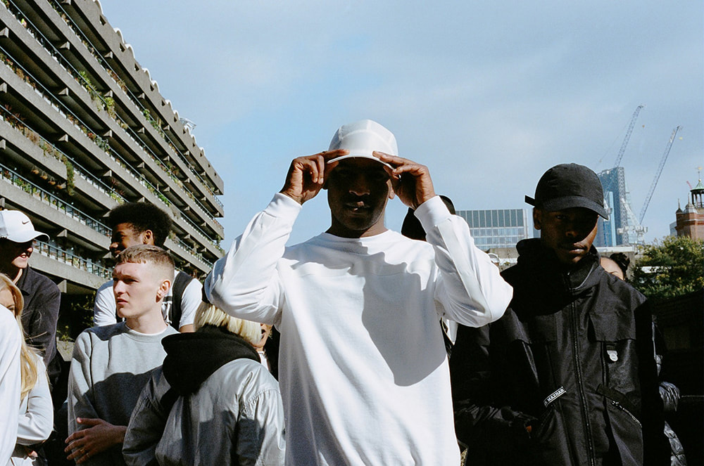
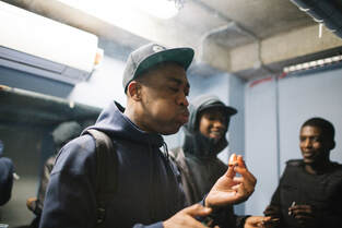
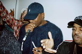
Vicky Grout is a photographer from London that specialises in photographing music, fashion and street photography. She is very well known in London's grime scene as she is considered the go to person to take photos. She has taken some very high profile photographs for people such as Skepta and AJ tracey. She also specialises in fashion photography and has taken some very high profile commercial shoots including shoots for brands such as Patta, Nike and Tommy Hilfiger.
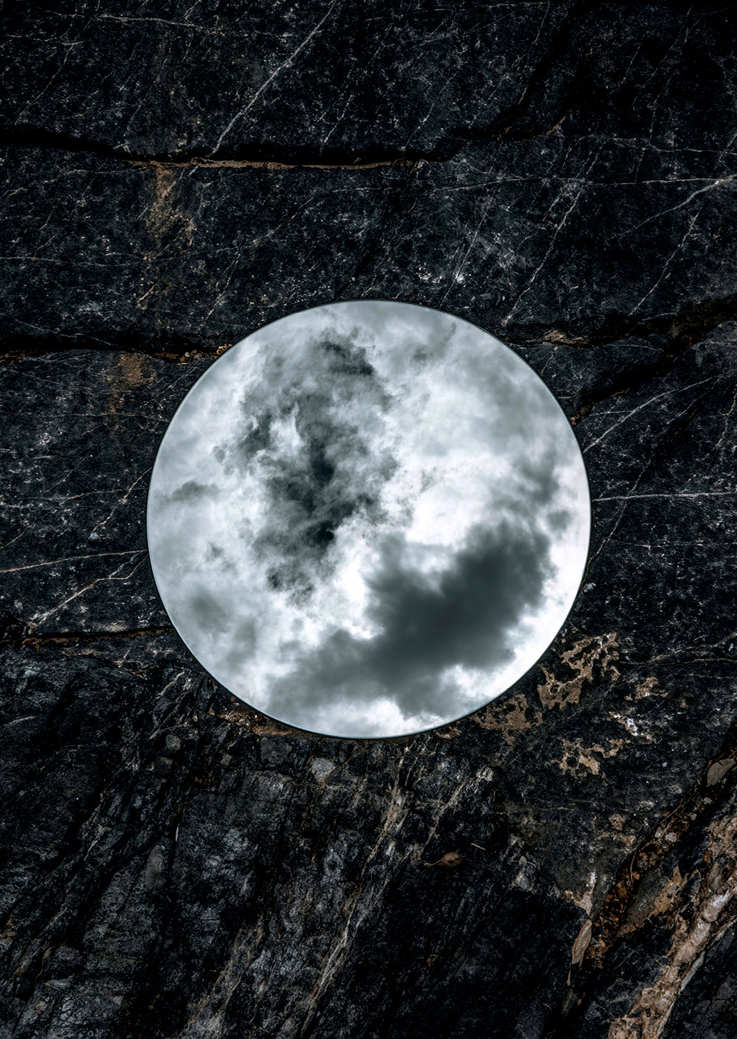
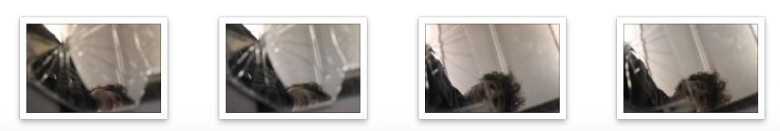
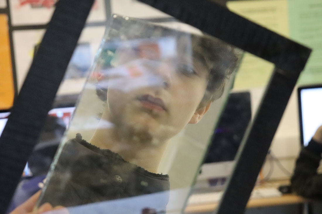
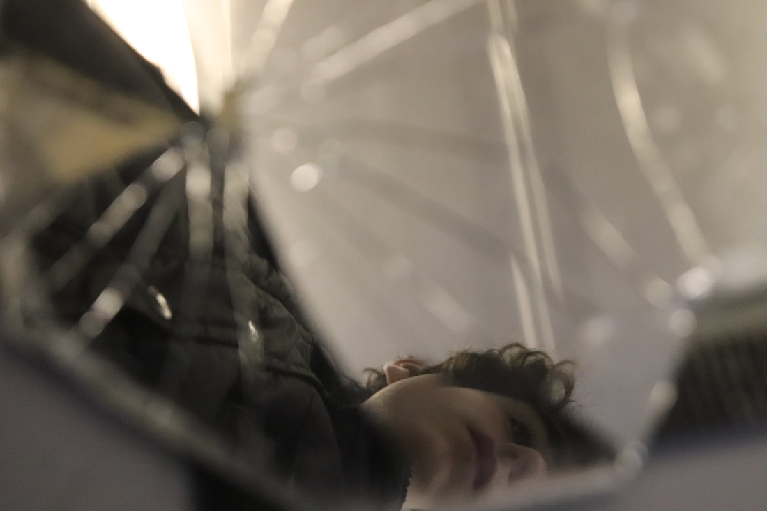
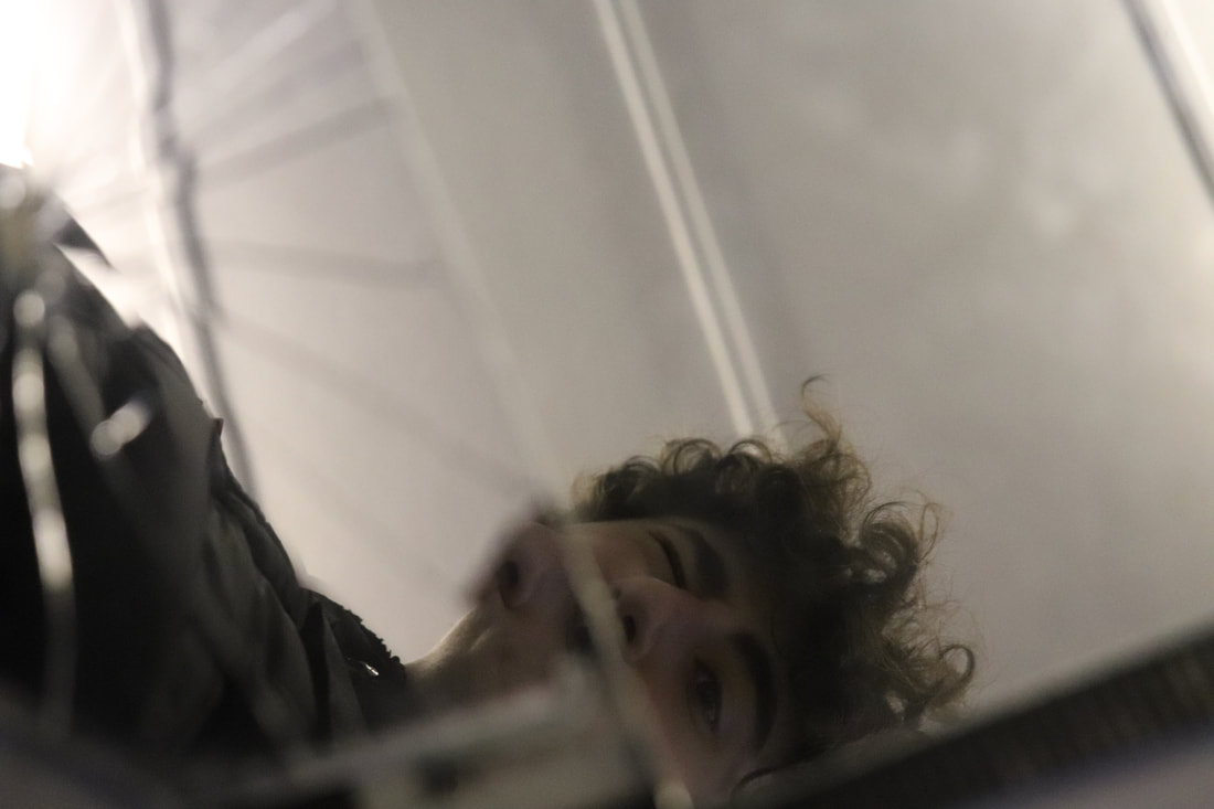
Mirror reflection
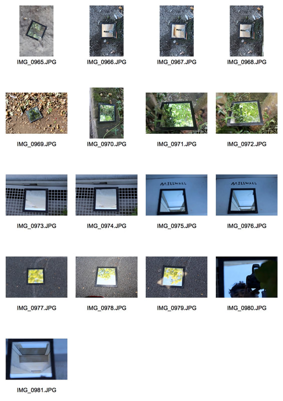
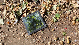
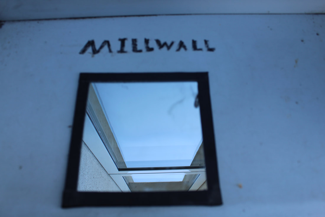
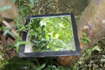
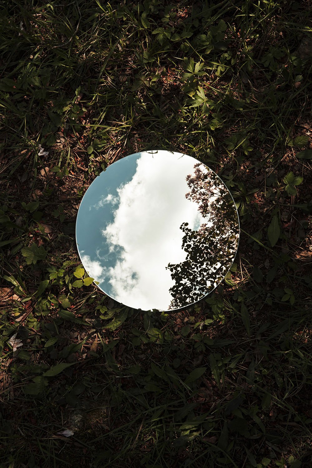
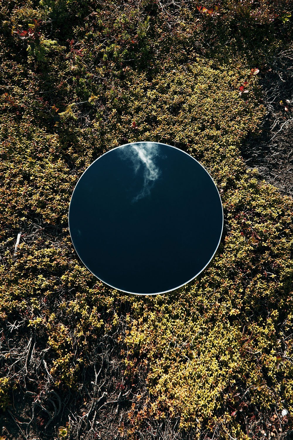
In this task I set out to replicate the work of Sebastian Mangnani by putting a mirror on the floor and capturing an image of both the mirror, the surface that the mirror is laying on and the image in the mirror. I also changed some camera settings such as the aperture to move the focus of different parts of the image.
|
|
|
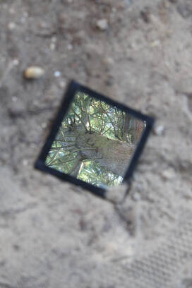
WWW: I captured a good selection of images that show Sebastian Magnani's influence on my work and I also did well at changing certain settings to create different effects within the images.
EBI: I feel as if I could've taken a second response to show a wider range of what this technique can achieve.
EBI: I feel as if I could've taken a second response to show a wider range of what this technique can achieve.
Sebastian magnani
Born 1985 in a small village in Canton Valais, Switzerland, surrounded by mountains, Sebastian Magnani discovered photography whilst training as a media designer in 2006. After 5 years as a creative in an advertising agency, he decided 2011 to turn his passion into a profession. Since then he has been making a living as a photographer, based in Zurich Switzerland
|
|
|
WWW: I managed to take good photos that slightly represent the link artists work. I changed the appeture setting to make sure that both the image I the mirror aswell as the background in focus.
EBI: I could've been more creative with my ideas.
EBI: I could've been more creative with my ideas.
Paper reflection
Stills
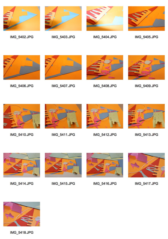
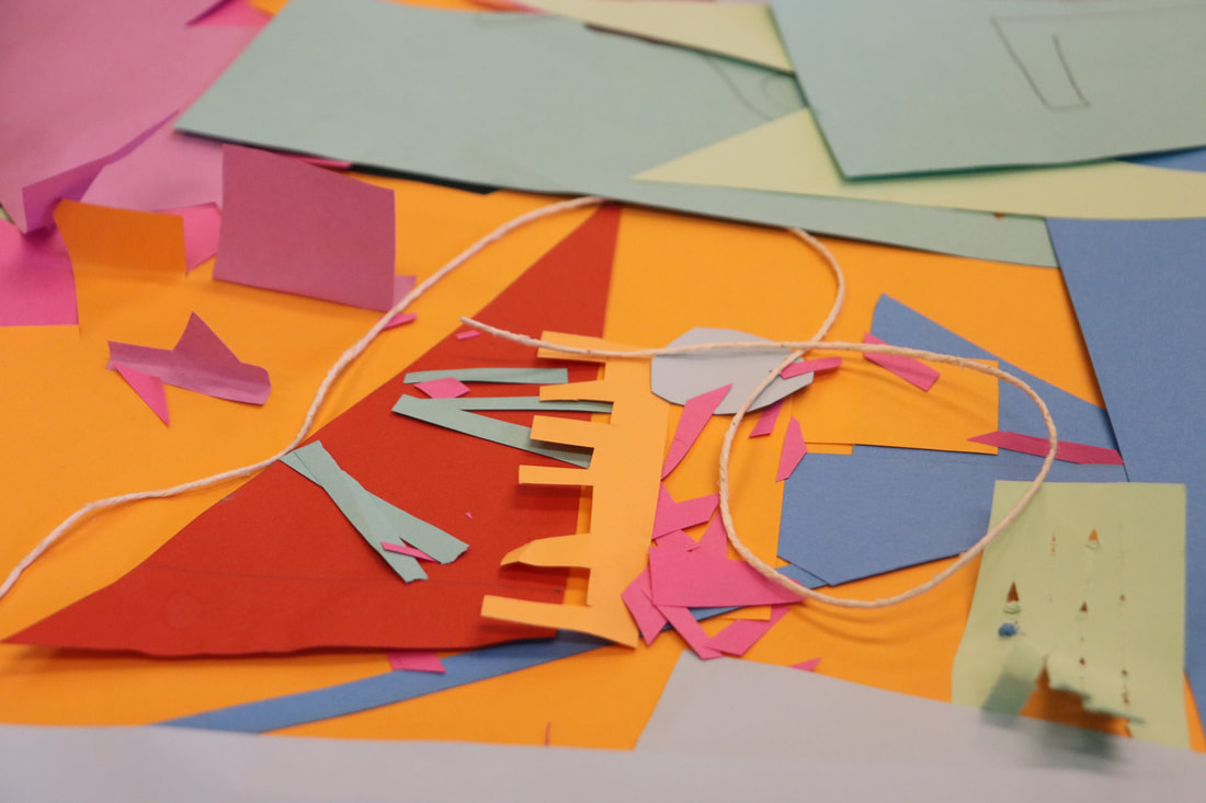
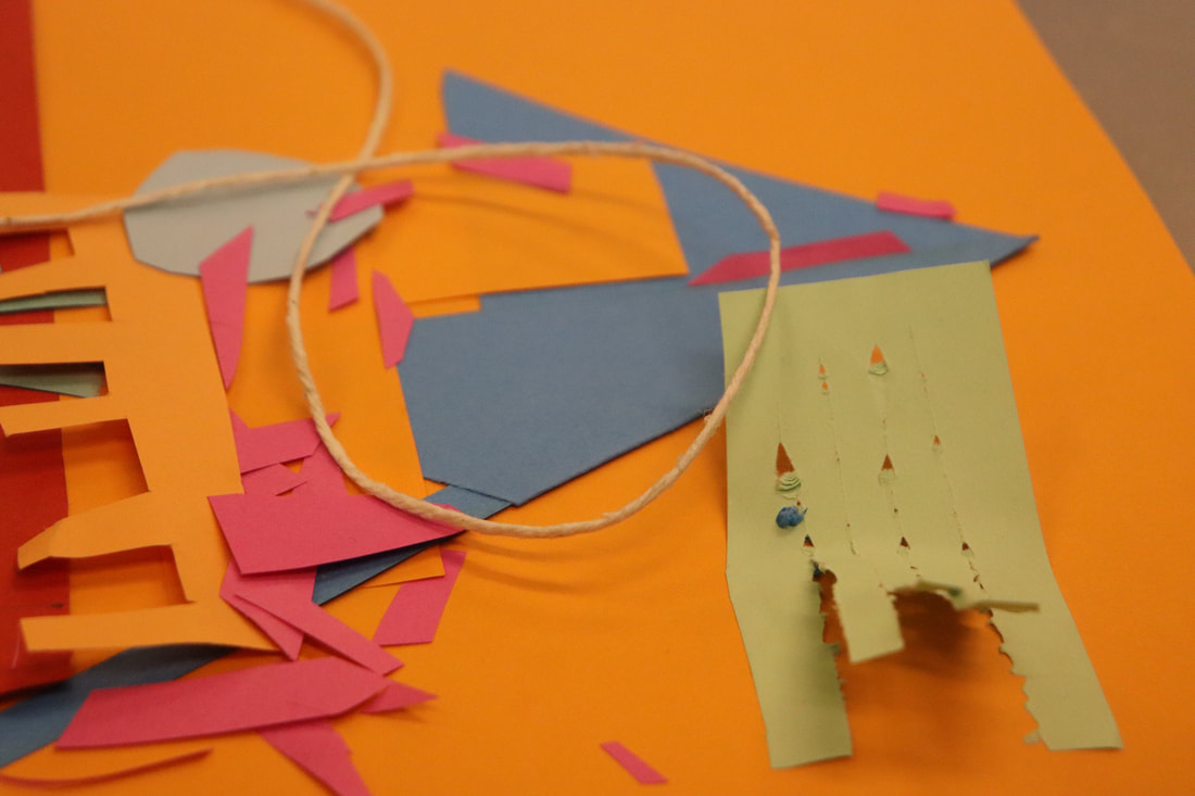
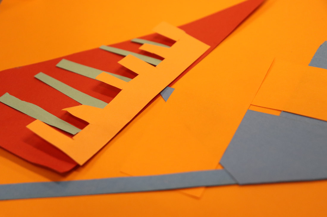
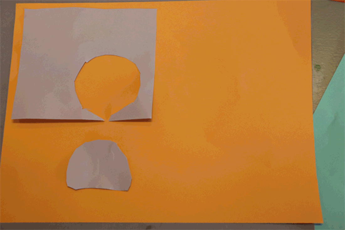
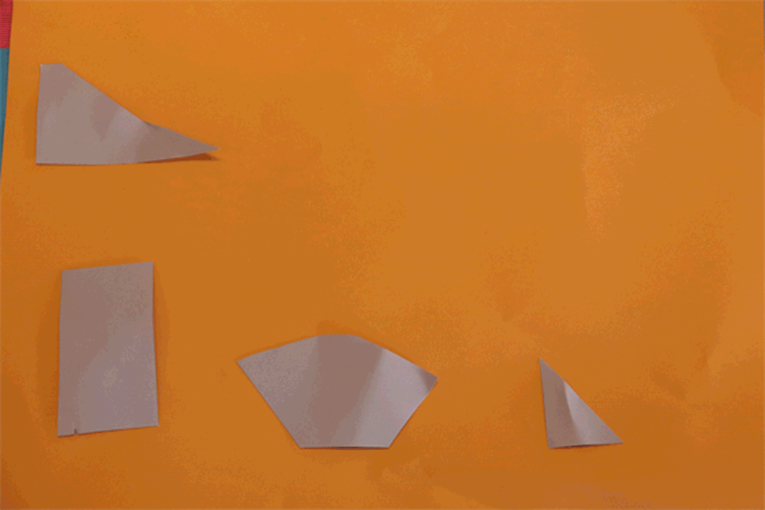
In this task I used coloured paper to cut a number of different shapes and patterns out of different sized and coloured paper. With these shapes I positioned them in a way that would create a reflective pattern only using the paper that I had.
|
|
|
WWW: I feel as though the shapes I chose to cut and the colours that I used really enhance the reflective effect that I was aiming for as by cutting up a shape that fits into another piece of paper and using the right colours it seems as if they are reflecting off one and other.
EBI: I feel as though I could've done it on a bigger scale with a much bigger piece of paper and more space. I also feel as if the images of the paper could be taken better. For example they could've had a higher level of lighting as the settings on the camera at the time make the images look a lot more bleak then they are.
EBI: I feel as though I could've done it on a bigger scale with a much bigger piece of paper and more space. I also feel as if the images of the paper could be taken better. For example they could've had a higher level of lighting as the settings on the camera at the time make the images look a lot more bleak then they are.
GIFS
This is a continuation of the last project except this time I was using the same skills of creating shapes by cutting coloured paper but I was making them into GIFS. I did this by taking a number of images of the shapes in different positions on the paper and using my photoshop skills I pieced them together to create the GIFS that I am left with.
WWW: I managed to make successful GIF's. I did this using Adobe photoshop and by taking multiple photos and using the features on the software to flick through the different files which therefore creates a GIF.
EBI: I should've had a better variation of colour in my Gifs. More colour enhances the effect of the different pieces of paper creating different effects on the GIF.
EBI: I should've had a better variation of colour in my Gifs. More colour enhances the effect of the different pieces of paper creating different effects on the GIF.
Tamara Lopez - link artist.
Tamara Lopez is a photographer and artist who is also a government official in America despite originally being from Puerto Rico. She states that she mainly expresses herself using art and photography.
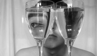
Distorted reflection
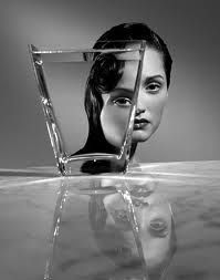
Antonio guíterrez
|
|
|
I felt very inspired after looking at the images by Antonio Guiterrez. This is because the refraction of the water distorts the model which makes the image slightly more sinister and much more dramatic.
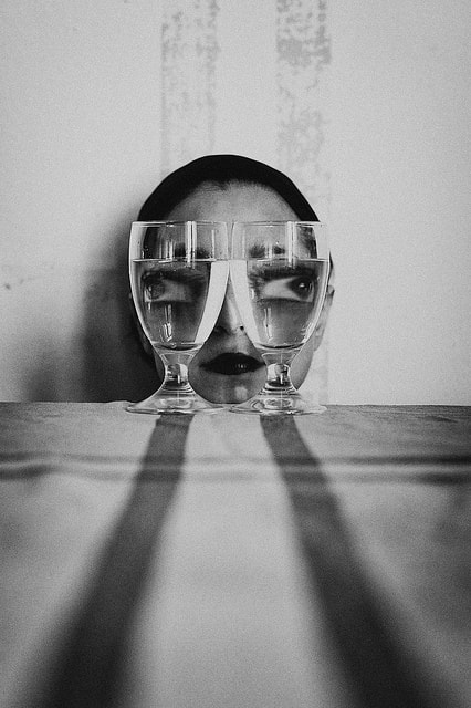
My response

|
|
|

|

|
|
WWW: I think the way I've positioned the subject of the photo well which really emphasised the distorted effect using the water. The way it was positioned meant that certain parts of his face were magnified or distorted and the rest of the subjects face stayed the same. I also moved the photos in black and white which I think really enhanced the photograph to make it much better.
EBI: I think I could've maybe been a bit more creative with the photos and used a few different techniques to achieve a different sense of distortion.
EBI: I think I could've maybe been a bit more creative with the photos and used a few different techniques to achieve a different sense of distortion.
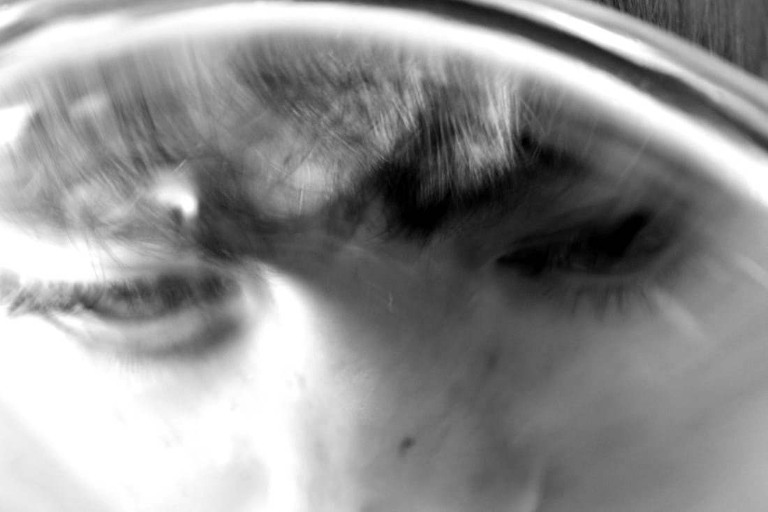
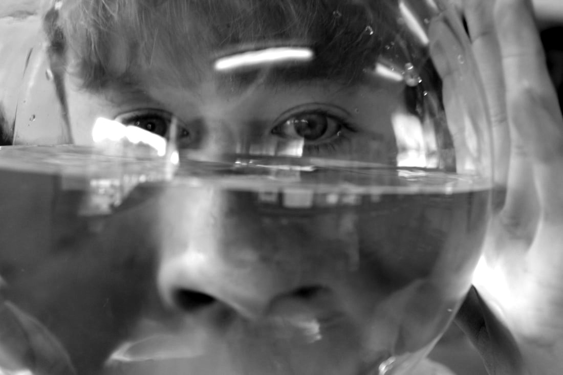
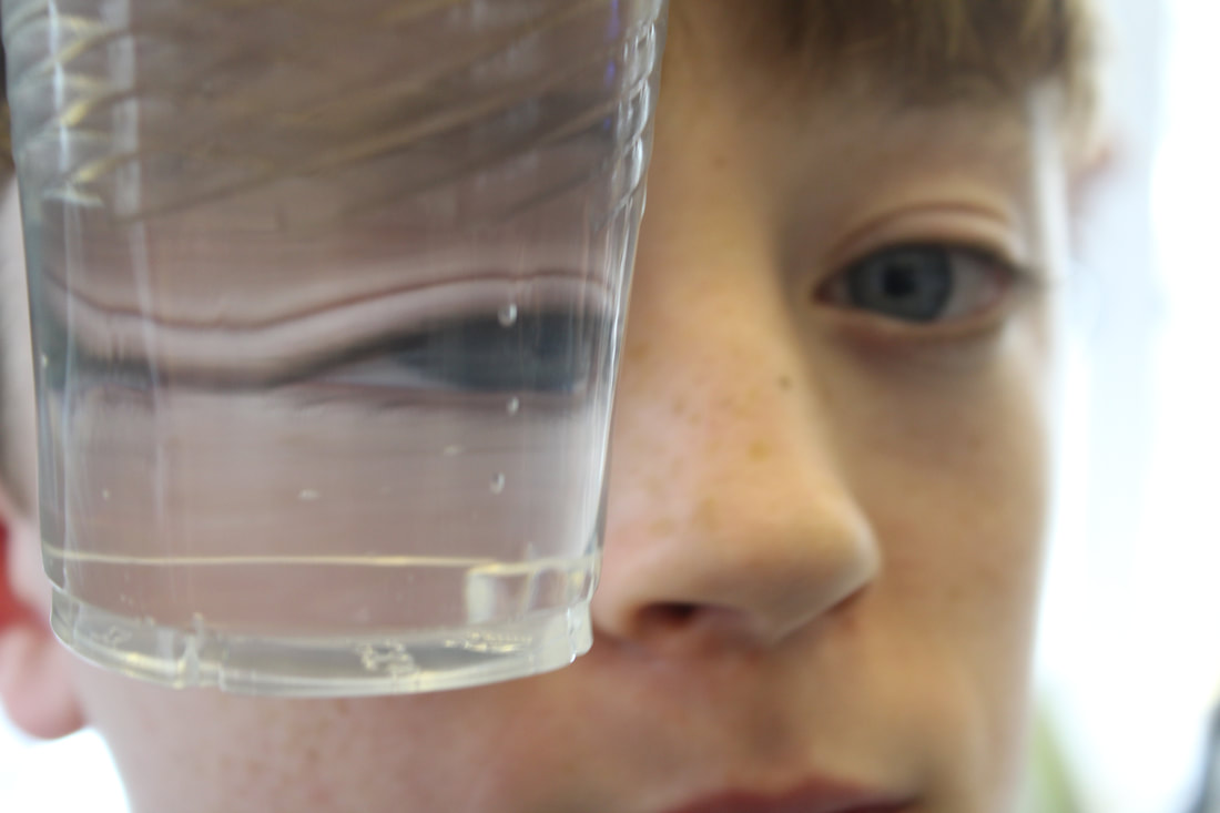
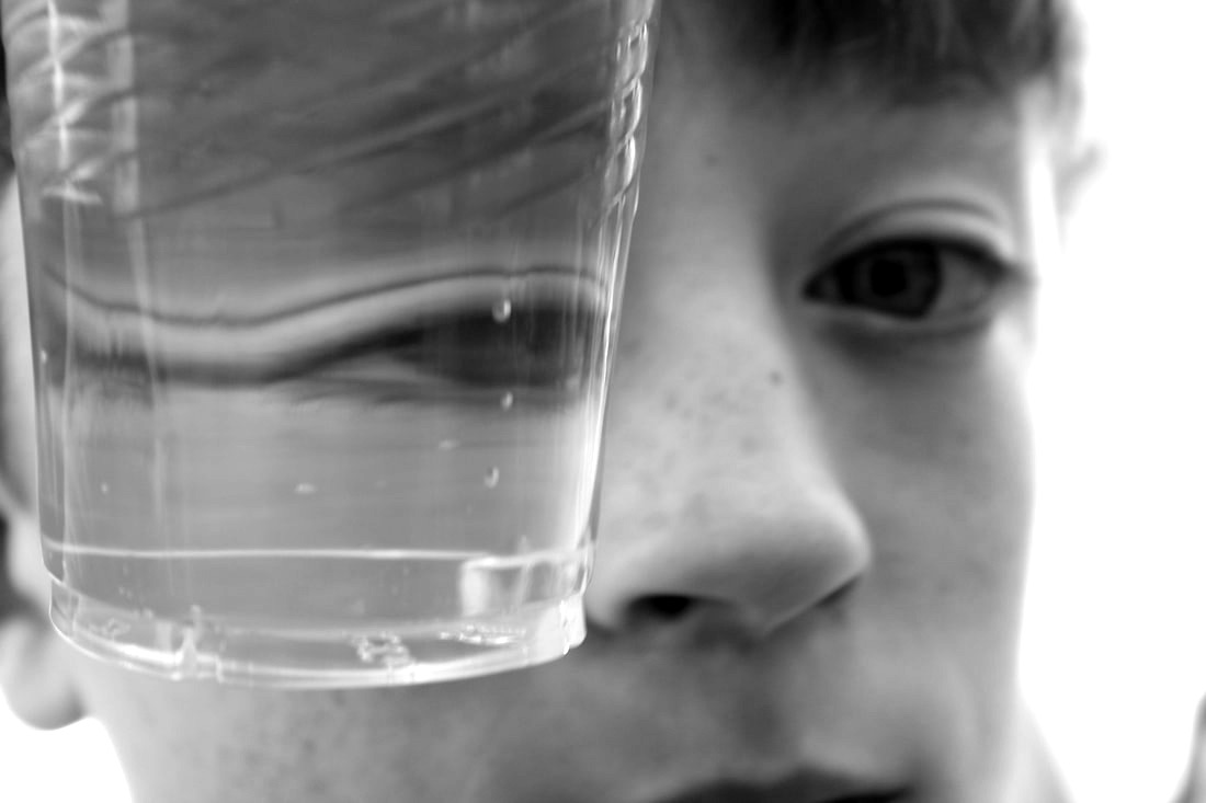
Mirror reflection - Portrait distortion.
In this task I took photos of a subjects face in a number of different mirrors which created a reflective effect of their face. I also used a cracked mirror which meant that a large portion of the images contained a distorted section of the subjects face. This fits into two parts of the course as we covered both mirror reflection and portrait distortion.
|
|
|
WWW: I managed to capture a good level of distortion within my images as well as getting a very good and effective set of reflective images. I also managed to clearly capture the subjects face within the mirror and the photo which was quite challenging as I had to take a photo of the subject within the mirror while making sure that there was no part of me or my camera in any of the images.
EBI: I feel as though all my images are a bit too similar as a lot of them look the same. I feel as though if I had taken a wider range of different photos then the final outcome would've been much stronger and I would've been left with images that show my aims off a bit better.
EBI: I feel as though all my images are a bit too similar as a lot of them look the same. I feel as though if I had taken a wider range of different photos then the final outcome would've been much stronger and I would've been left with images that show my aims off a bit better.
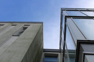
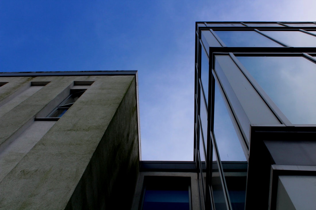
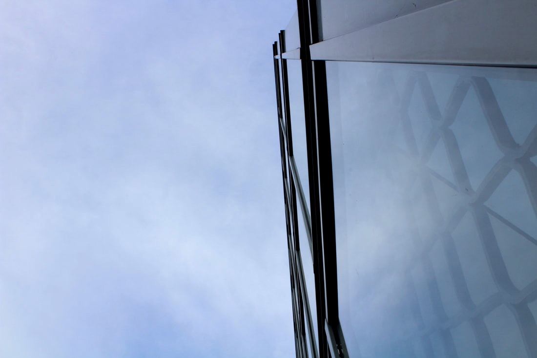
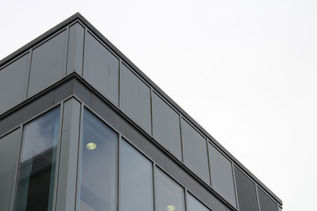
Patterns, structure and reflection
In this task we were told to go out in the school and photograph reflective images using the buildings around the site. We were also told to go out and find buildings or structures that had patterns on them. We were also told to look out for two buildings next to each other that represent an effect of reflection naturally. I then got the photos i took and edited them and to create a better looking more effective shot using different effects that i used from weebly.
|
|
|
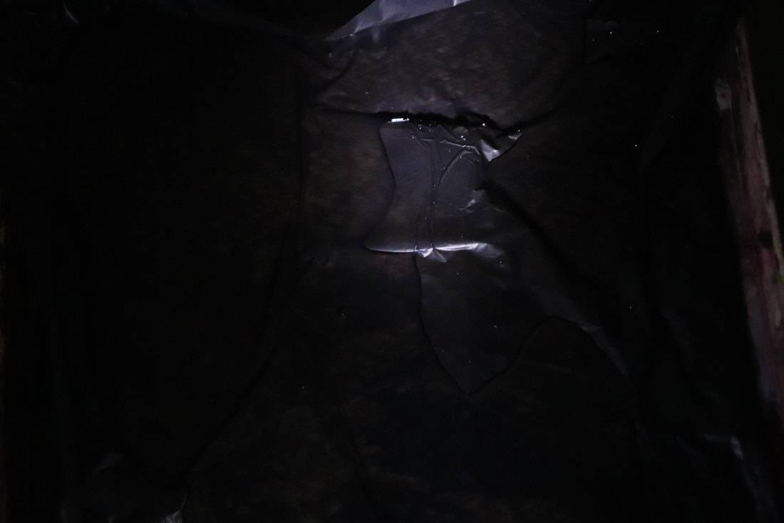
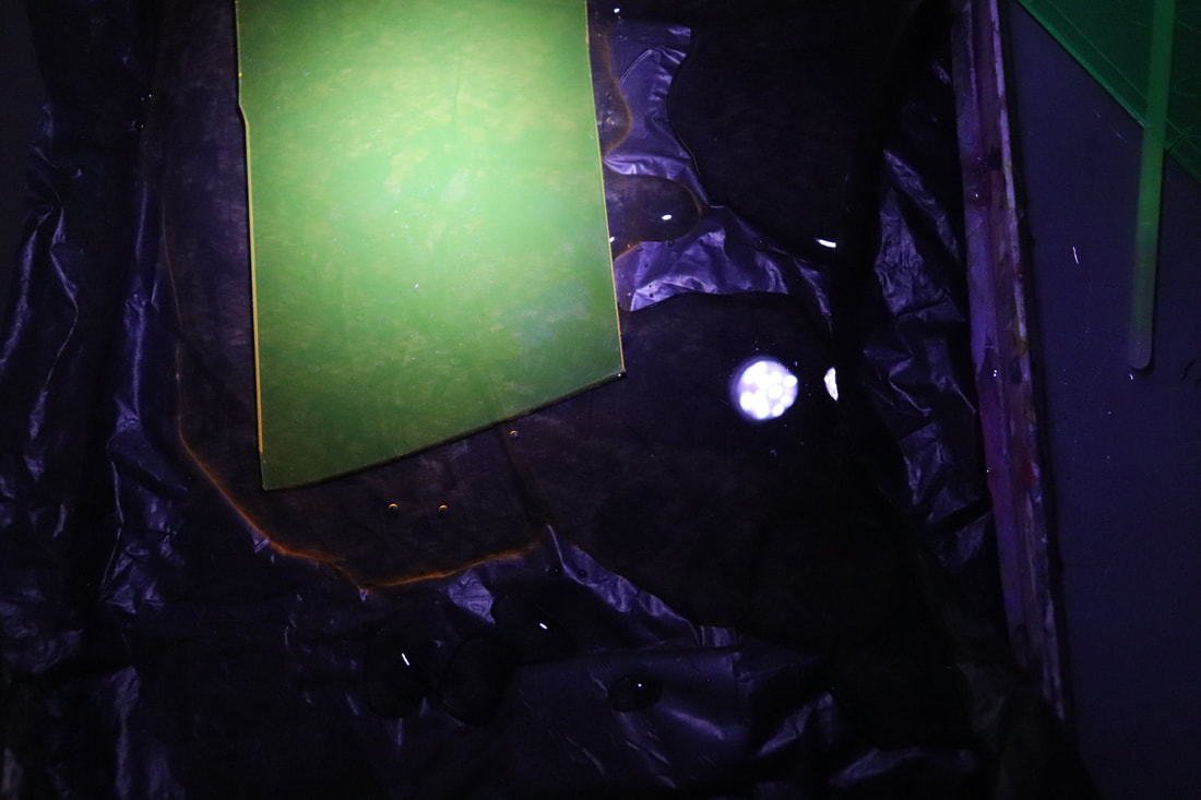
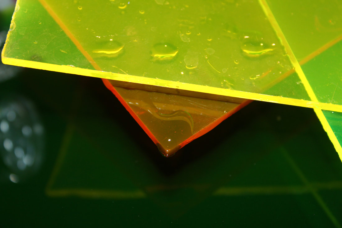
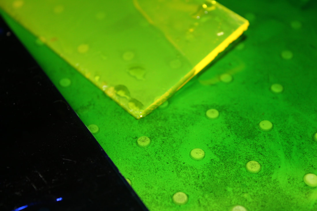
water reflection
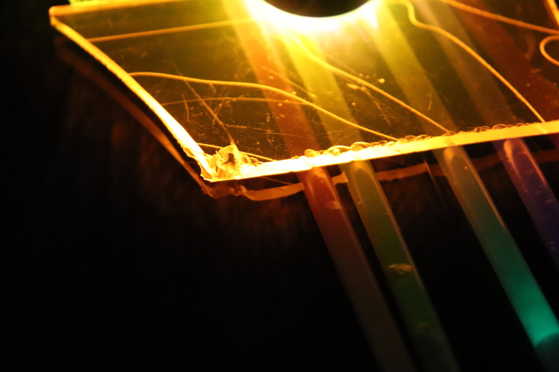
In this task i set out to use different coloured materials and different light sources to create a reflective surface on a tray of water. I did this by taking coloured plastic and positioning it in such a way that the colour reflects on the way and the light source that I used which was a torch really enhances the effect of the colour.
|
|
|
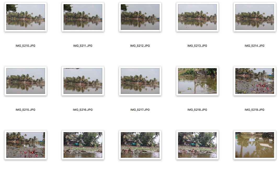
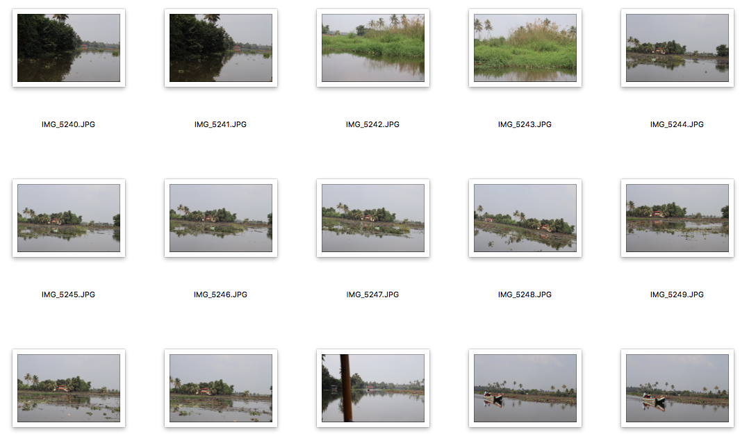
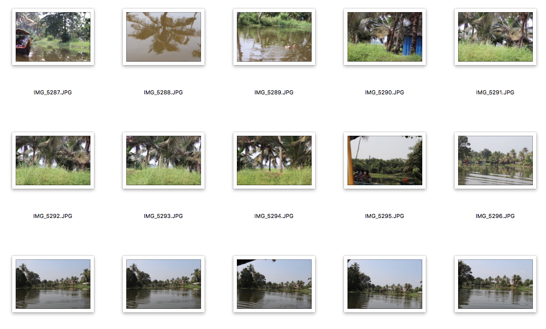
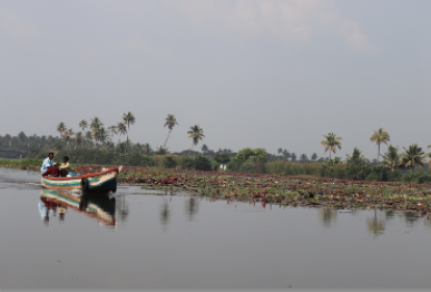
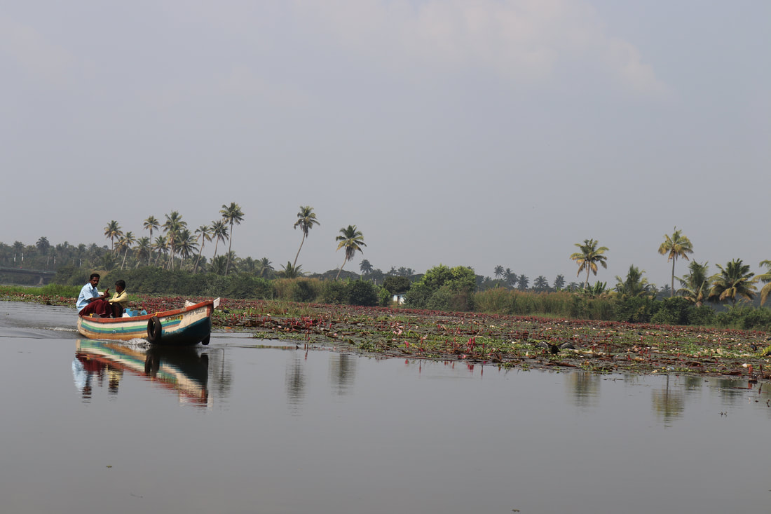
Water reflection second response.
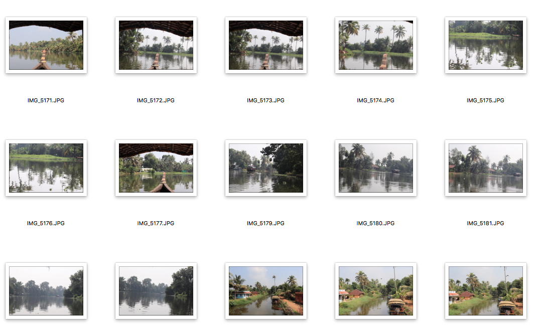
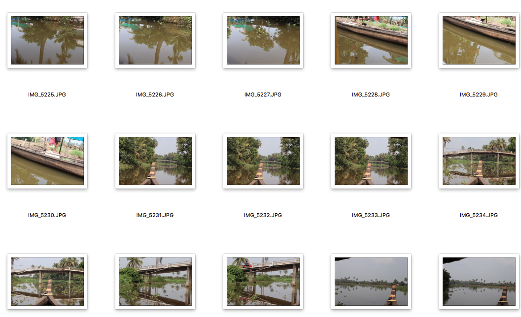
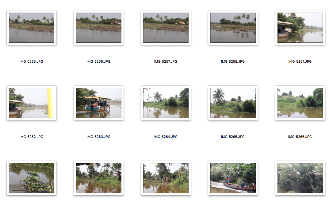
For this shoot I was on Kerala's backwaters in India and I took photos of the natural surroundings and local life while using the water surrounding to reflect the images back onto themselves.
|
|
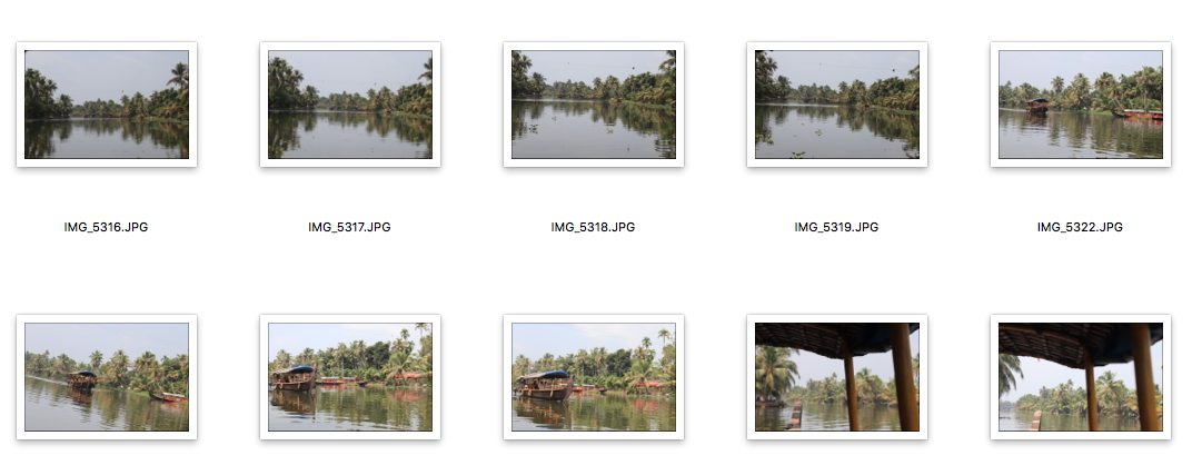
WWW: I managed to take an array of interesting shots, that replicate a journey along the river. The different shots allow the piece to have very good reflection and it shows the kind of environment that shows the reflection.
EBI:
EBI:
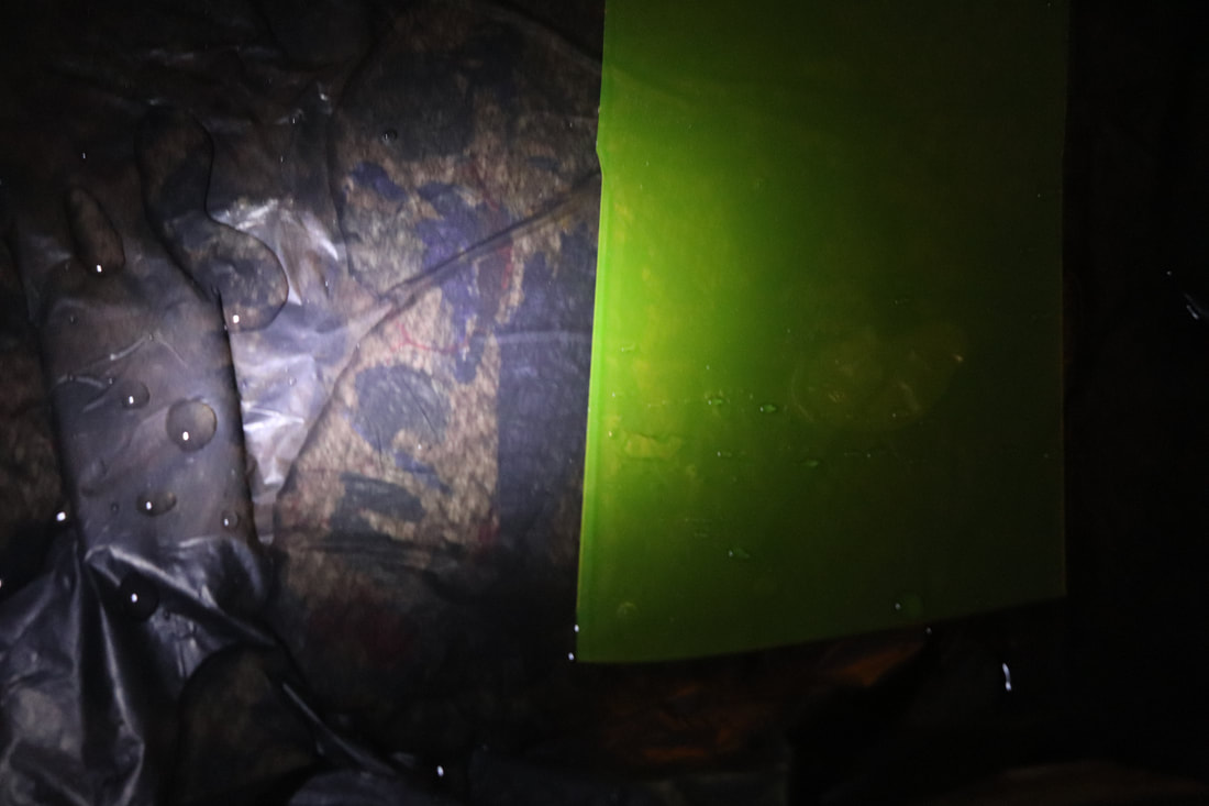
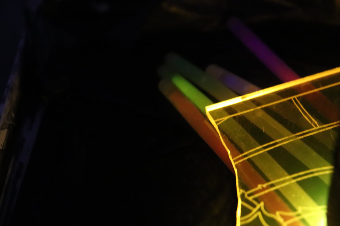
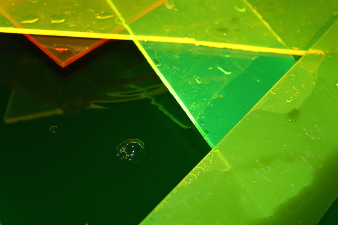
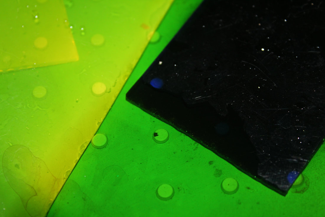
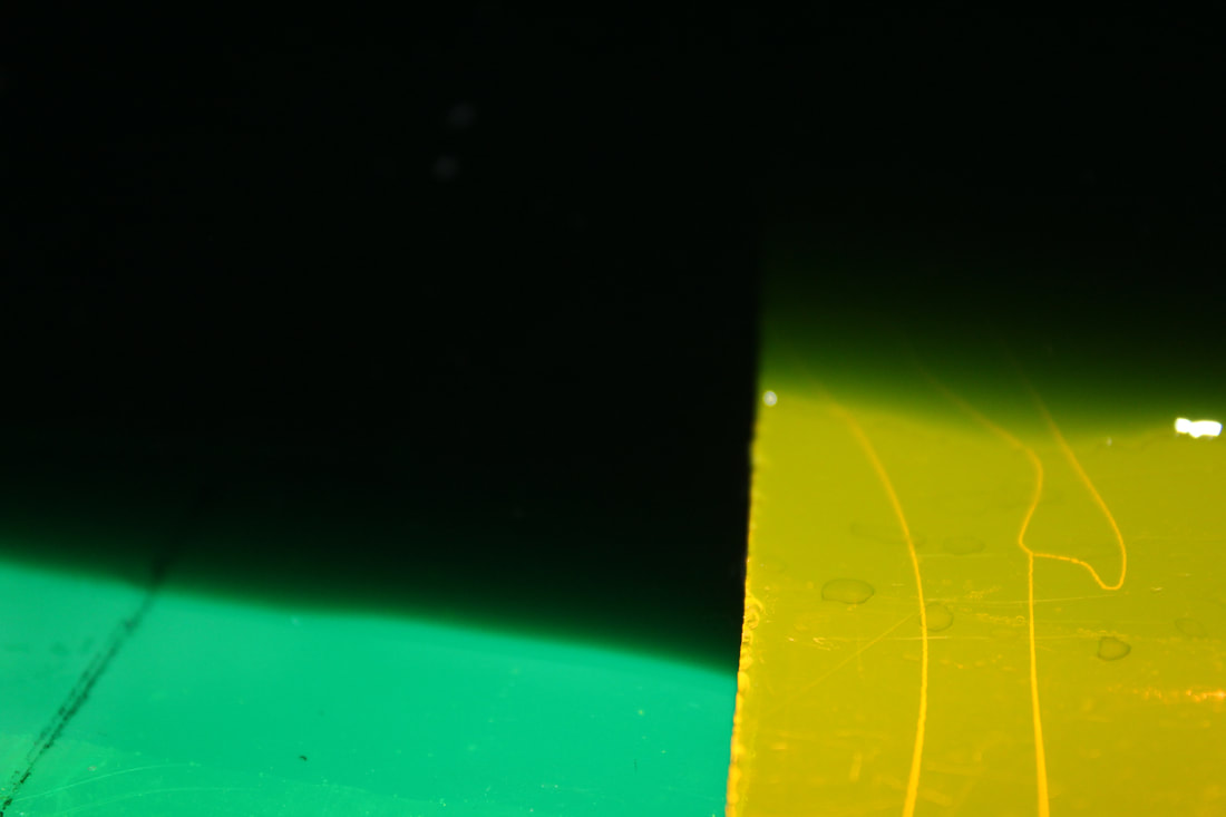
Slava Semeniuta
Slava Semeniuta is a photographer and artist who was born in Siberia but for the majority of his life he has lived in Minsk in Belarus. He likes to highlight neon colours as he feels like they are rarely naturally found. He explains how he has always found neon colours very fascinating and they are clearly portrayed in his work.
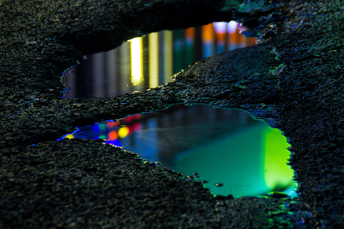
In this task I set out to take images replicating Slava Semeniuta's work by using coloured plastic and a torch to reflect the colours onto water. I would shine the torch onto the surface and capture the image of the highlighted plastic.
|
|
|
WWW: I took a good set of photos that were highlighted well with the lights and they showed a good range of colour and light.
EBI: I don't feel as though I have taken enough images as I feel that I could've explored this concept further.
EBI: I don't feel as though I have taken enough images as I feel that I could've explored this concept further.
Portrait reflection
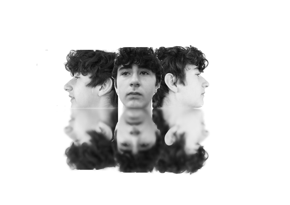
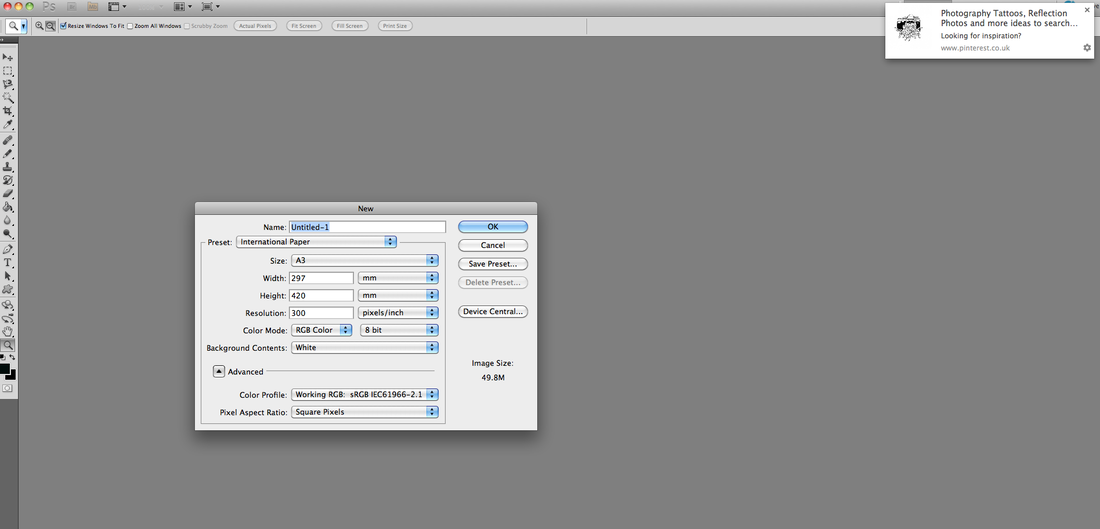
Final Piece first idea
In this task I set out to replicate an earlier piece in order to create a final piece. I did this by taking portraits from multiple angles and merging them together using the techniques I have learnt in photoshops across the course. With the merged portraits I managed to reflect them using more photoshop techniques. I then used the radial blur effect on photoshop which blurred the reflected side of the image.
How i did it.
|
|
Final Outcome
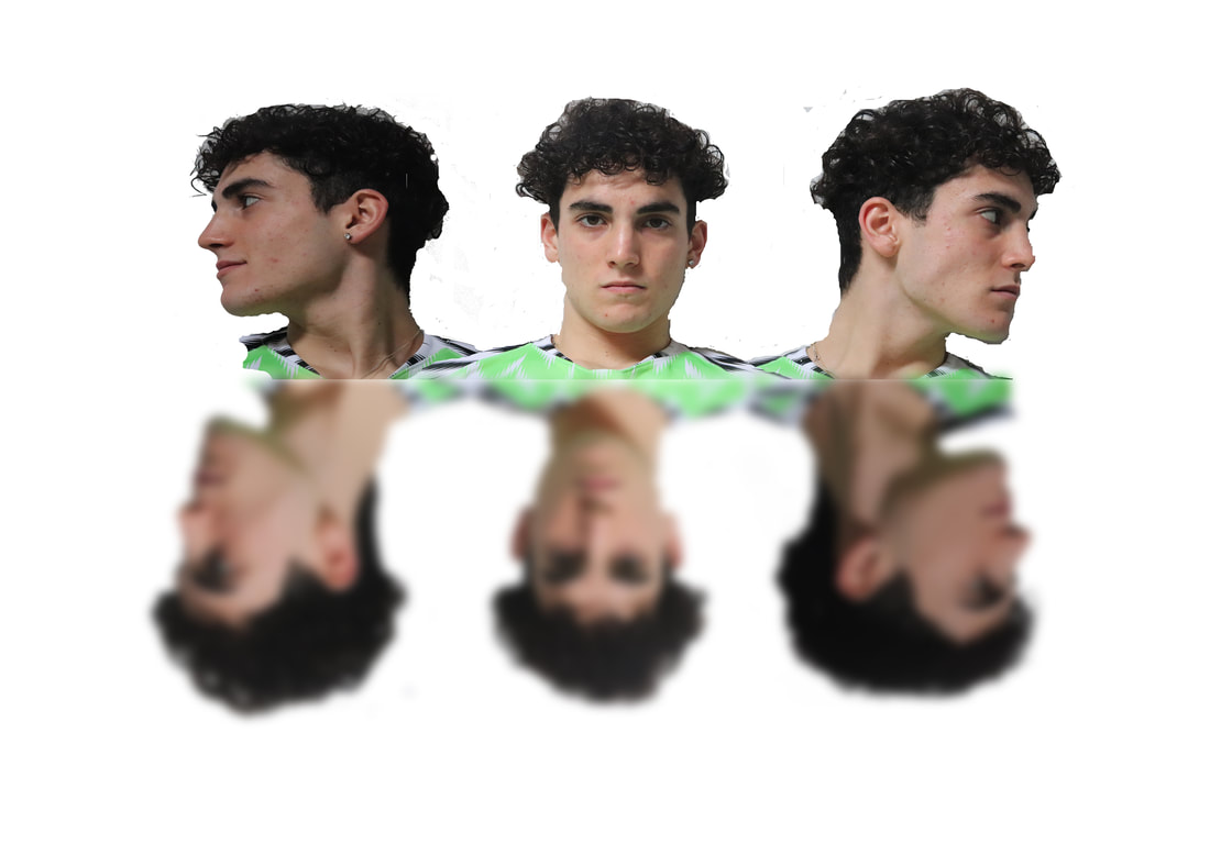
WWW: I managed to capture the reflective effect of the same portrait well and did well at replicating the photo that I created earlier in the course which I what I was hoping for. I also think that by putting the image in black and white it enhances the original as I felt as if the original was too bright and loud.
EBI: I do not feel as if these images were strong enough for a final piece as they weren't very well edited and I think the idea is a bit dull as it is capturing the same images. For this reason I decided to continue with the idea of reflecting the same image and using that to create a bigger effect however I have decided to do it with a different image which I feel can give me a more powerful effect.
EBI: I do not feel as if these images were strong enough for a final piece as they weren't very well edited and I think the idea is a bit dull as it is capturing the same images. For this reason I decided to continue with the idea of reflecting the same image and using that to create a bigger effect however I have decided to do it with a different image which I feel can give me a more powerful effect.
Final piece development
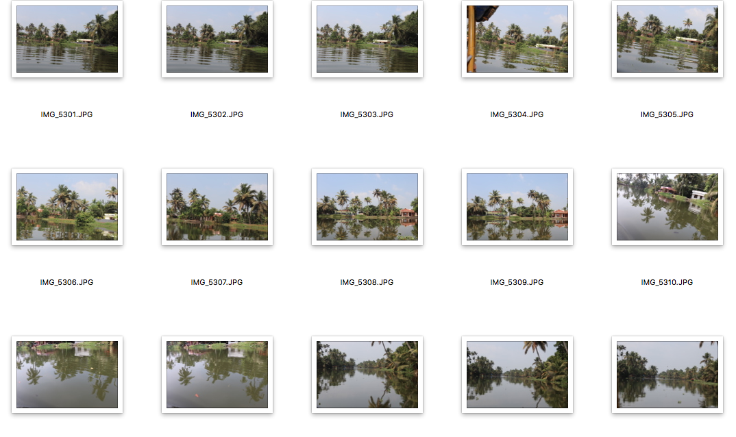
I decided to develop my final piece because I felt that I could use the same basis with using one image and positioning it in different ways to create a reflective image. However I felt that the piece would benefit from having a more reflective background and therefore I chose to use water reflection. The images were taken in Kerala in India and I think I managed to create a powerful image using a mixture of the surroundings as well as using images of the local culture.
How I did it
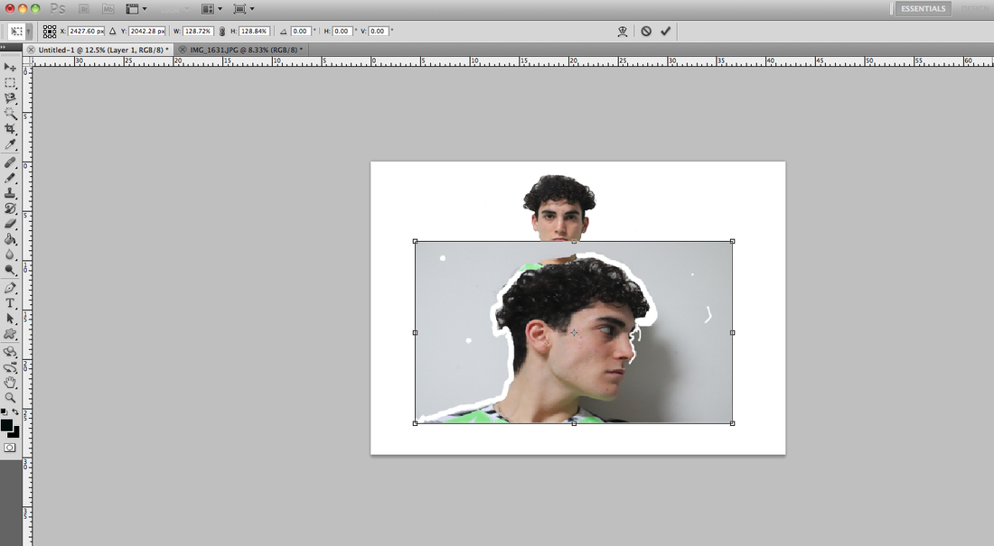
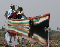
First I got the image in the original form and copied it onto a fresh background.
|
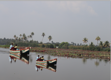
The next step was to copy and paste the boat in the image onto the same background.
|
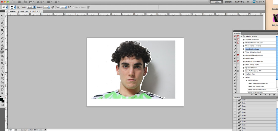
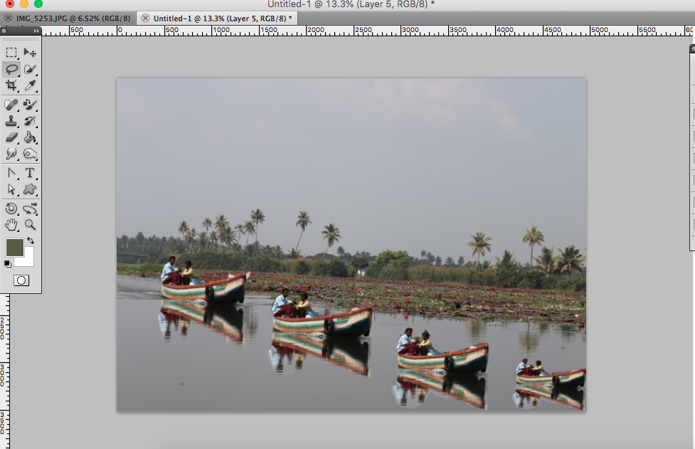
I then used the lasso tool to cut out all the background features from the boat image that would stand out.
|
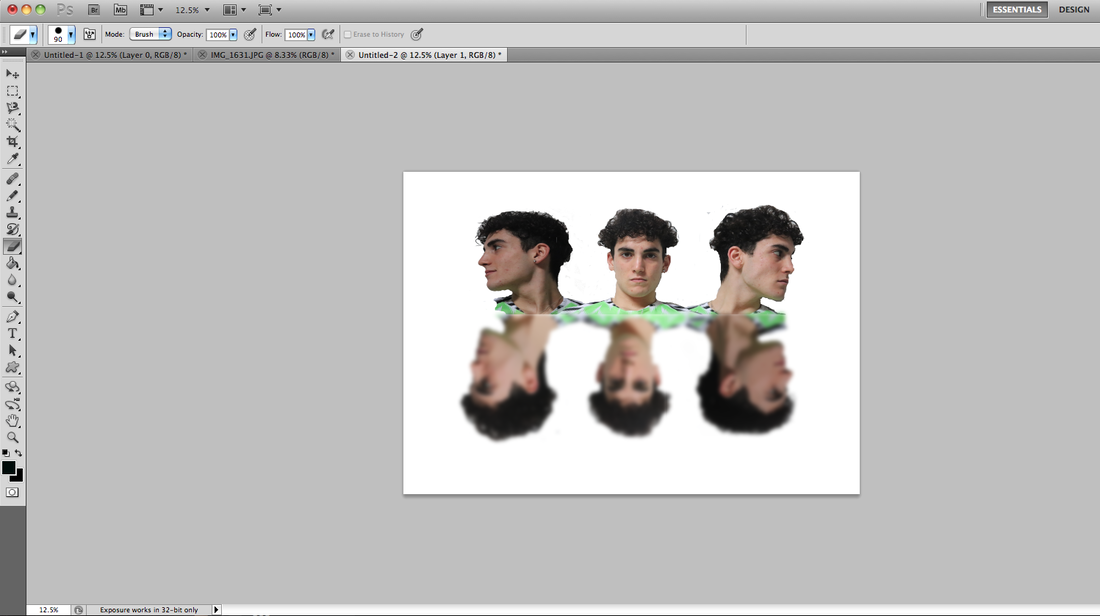
I then resized all the pasted images and placed them ascending towards the bottom corner of the image which ultimately left me with the image I had in the end.
|
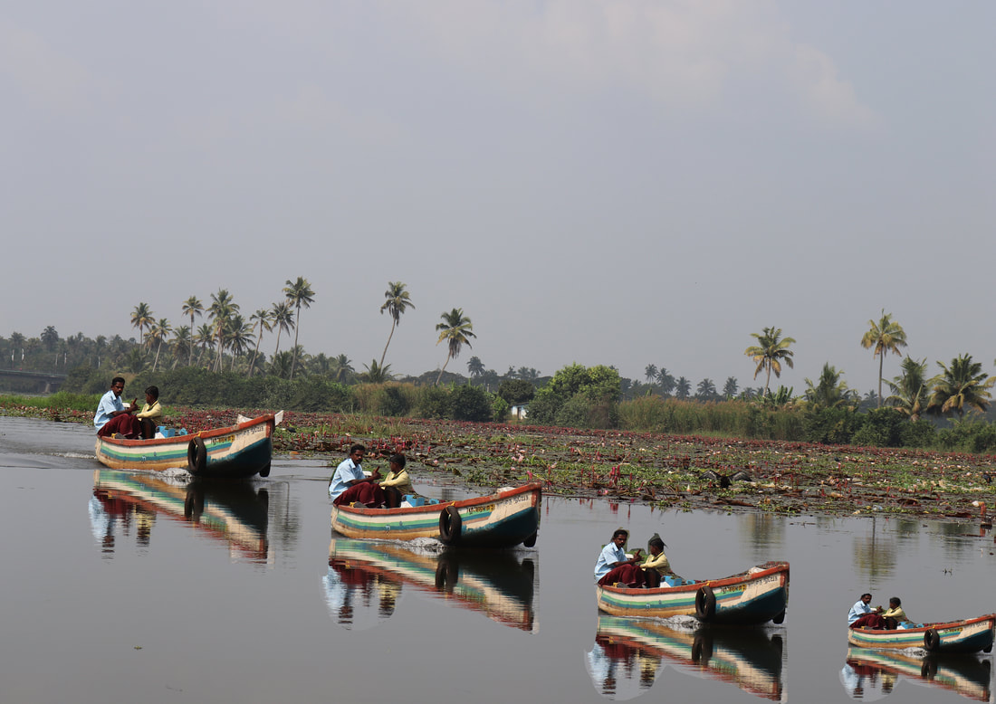
WWW: I think that the image is a drastic improvement from my first final piece response and I feel as though the way that I have developed my ideas has been very effective. I also think that the original is an extremely well taken photo and I think even that shows off the reflectiveness that I was trying to achieve. I also think that the edit has taken the image one step further and made the images really powerful and an extremely effective way of showing the effect I wanted to.
EBI: I feel as though the cutting using the lasso tool in the edit could've been more exact as there is a couple patches that I wasn't able to erase.
EBI: I feel as though the cutting using the lasso tool in the edit could've been more exact as there is a couple patches that I wasn't able to erase.
